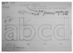
Monday 2nd July 1979, straight after five years of student life in the UK, was my first day at Banks and Miles, a London based graphic design company. That morning was a bit of a shock. I was given a few large broadsheets with litho printed Johnston type. I was definitely confounded by being asked straightaway to design a new Johnston family with three weights — Light, Medium and Bold — within a month or two. (…) Colin Banks, an external assessor for the LCP, had asked me if I would be interested in redesigning a typeface. I was grateful for the job (…), but the prospect was daunting because I had no experience in type design and very little English language. (…) I expected that in the office there would be at least a kind of preliminary training or guidance for a novice designer — what drawing tools to be used, what size the original artwork should be, how to typeset with newly drawn letters. I remembered one college day in 1975 when our tutor took us to the drawing office of the Monotype Corporation in Salfords. They had impressive purpose-built drawing equipment, precision machines and many skilled draughtsmen and women. In contrast, my tools were very basic: pencils, felt tip pens, a Rotring pen with 0.1 mm nib, Winsor & Newton’s fine brushes and some photographic equipment in the darkroom.
Interesting article about Eiichi Kono’s1979 redesign of the „Johnston“ typeface that London Transport has been using in the Underground since 1913.